THE JOURNAL / COLOSSUS LUX
Triptych Wall Art: One Scene, Three Panels, One Decision
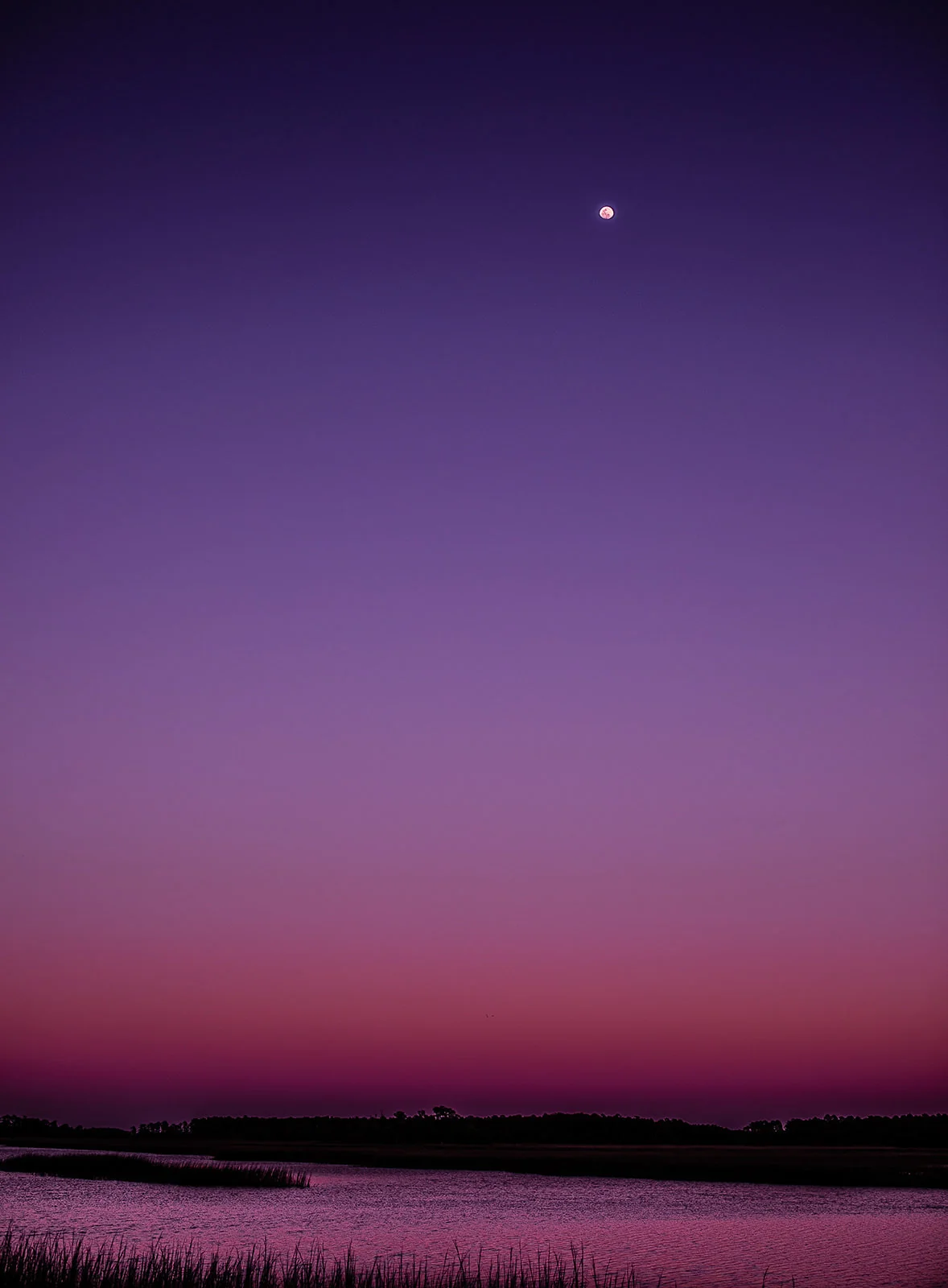
A triptych takes one scene and presents it across three panels. Done well, the divisions are not a decoration added afterward. They become part of how you read the image. Your eye crosses a gap, picks up the line again on the next panel, and completes the place in your own mind. That small act of completion is why triptych wall art holds attention on very wide walls where a single frame can start to feel like a window you have already understood.
I make multi panel work from photographs built for scale. Colossus Lux is the fine art practice of Vitor Lindo, based in Metro Atlanta and working often around Savannah. The images begin as gigapixel photographs, stitching hundreds of photographs into single images installed at architectural scale. Starting from that much information matters for panels, because each section is effectively its own large print. If the source file is thin, the panel closest to a chair or a hallway is the one that will show it first.
Triptych, diptych, or a single print
The choice between formats should follow the wall, the scene, and how people move through the room. A single print gives the calmest reading and suits a scene with a strong internal structure. A diptych, two panels, creates a pause in the middle of the image. Diptych photography works well with a scene built around two related elements, or with a pair of separate but connected images placed in conversation with each other. A triptych gives rhythm. Three panels establish a beginning, a middle, and a resolution, even in an abstract stretch of dune grass or water.
Think about it in practical terms:
- Choose a single print when the wall is moderate, the scene is quiet, and you want no interruption in a horizon or reflection.
- Choose a diptych when the wall is wide but the room is narrow, so two larger panels keep each section substantial.
- Choose a triptych when the total width is large, when the wall is seen from several angles, or when panel rhythm suits the architecture of the room.
- Choose separate related images as a set when the panels need to stand alone if the set is ever divided between rooms.
None of these formats is more serious than the others. The mistake I see most often is choosing a triptych because it feels like a safer way to fill width, without checking whether the scene actually benefits from being divided. Some scenes do. Some lose the very continuity that made them worth printing.
Where the divisions fall matters most
In triptych photography, panel breaks should respect the structure of the scene. A break through open sky or calm water is easy for the eye to cross. A break through a distinctive tree, a building edge, or the most detailed part of a shoreline asks more of the viewer and can look like an accident rather than a decision. When I lay out a triptych, I start with the lines that carry across the whole image: a horizon, a creek, a dune ridge, a band of shadow. The breaks go where those lines are steady.
There is a second consideration that is less obvious. Each panel should have a reason to exist on its own terms, with balanced weight, even though it is not meant to hang alone. If the middle panel holds all the interest and the side panels are only filler, the set will feel unresolved. A good test is to cover one panel at a time and ask whether the remaining two still look considered. They should, even if the full meaning needs all three.
Spacing, height, and total width
Spacing is where most multi panel installations succeed or fail. The gaps are part of the work, so they need to be consistent and intentional. For most residential walls I start the discussion around a gap of one to two inches between panels, then adjust for total size. Very large panels can carry a slightly wider gap. Small panels usually need a tighter one, or the set drifts apart visually.
Total width is the measurement that matters for the room. Add the three panel widths and the two gaps together, then judge that full span against the wall and the furniture below it, using the same proportions described in the wall art size guide. People often order panels that are each a good size, then discover the combined span is either crowded or lost. Work backward from the span you want, then divide it into panels and gaps.
Height needs the same care. The set should hang as one object, with the center of the group near eye level for the way the room is used. In a dining room, that may be a little lower than in a hallway, because people view it seated. Over a long, low sideboard, keep the bottom edge close enough to the furniture that the group reads as connected to it, rather than as a separate band floating on the wall.
The gaps are part of the work, so they need to be consistent and intentional.
For installation, measure from the center outward, level the middle panel first, and set the side panels from it. Walls are rarely as true as they look, and a small error multiplied across three panels becomes visible. On large scale work, professional installation is worth the cost, particularly on plaster, paneling, or masonry.
What resolution means across three panels
A triptych can disguise a weak file at a distance, because the gaps break up the image. Up close it cannot. Each panel is viewed on its own when someone walks the length of the wall, which in a hallway or a lobby is exactly how the work will be seen. Fine detail in sand, grass, stone, or water has to hold at reading distance in every panel, not only in the center.
That is the reason I build these images from stitched captures rather than a single enlarged frame. The process is slower, and for a small print it would be unnecessary. For prints measured in feet, not inches, it is the difference between a surface that looks smooth from six feet away only, and one that stays convincing when a guest stops in front of the left panel to look at the texture of the dunes. The panoramic print sizes guide covers how total dimensions are planned, and the same thinking applies when those dimensions are divided into three.
Scenes that divide well
Open, layered scenes divide best. Dune fields, marsh, calm water, and wide skies all carry lines across a frame without depending on one object. Architectural subjects can also work, if the geometry is strong enough that the breaks align with it rather than fight it.
Scenes that depend on a single, precise moment of symmetry are harder. A perfect reflection cut by two gaps can still succeed, but the alignment tolerances become tight and the installation has to be exact. Portraits and scenes with faces almost never belong in a triptych of this kind. The divisions draw attention to themselves in the wrong way, and a break near a face will dominate the image no matter how good the photograph is.
Cost and practical questions, without the sales talk
Three panels mean three mounts, three surfaces to keep clean, and more wall fixings than a single piece. They can be easier to move and to fit through a stairwell or elevator than one very large panel, which is a real advantage in older buildings in Savannah and in many Atlanta homes. They also allow a set to be rehung in a different configuration later, within limits, though I would not buy a triptych as three separate pictures in waiting. Buy it as one work.
Continue the conversation
If you are deciding between a single panoramic print, a diptych, and triptych wall art for a specific wall, send the width and height of the wall, a photograph taken straight on, and the distance from which it is usually viewed. We can work through the panel layout, spacing, and total scale for your space at Colossus Lux.